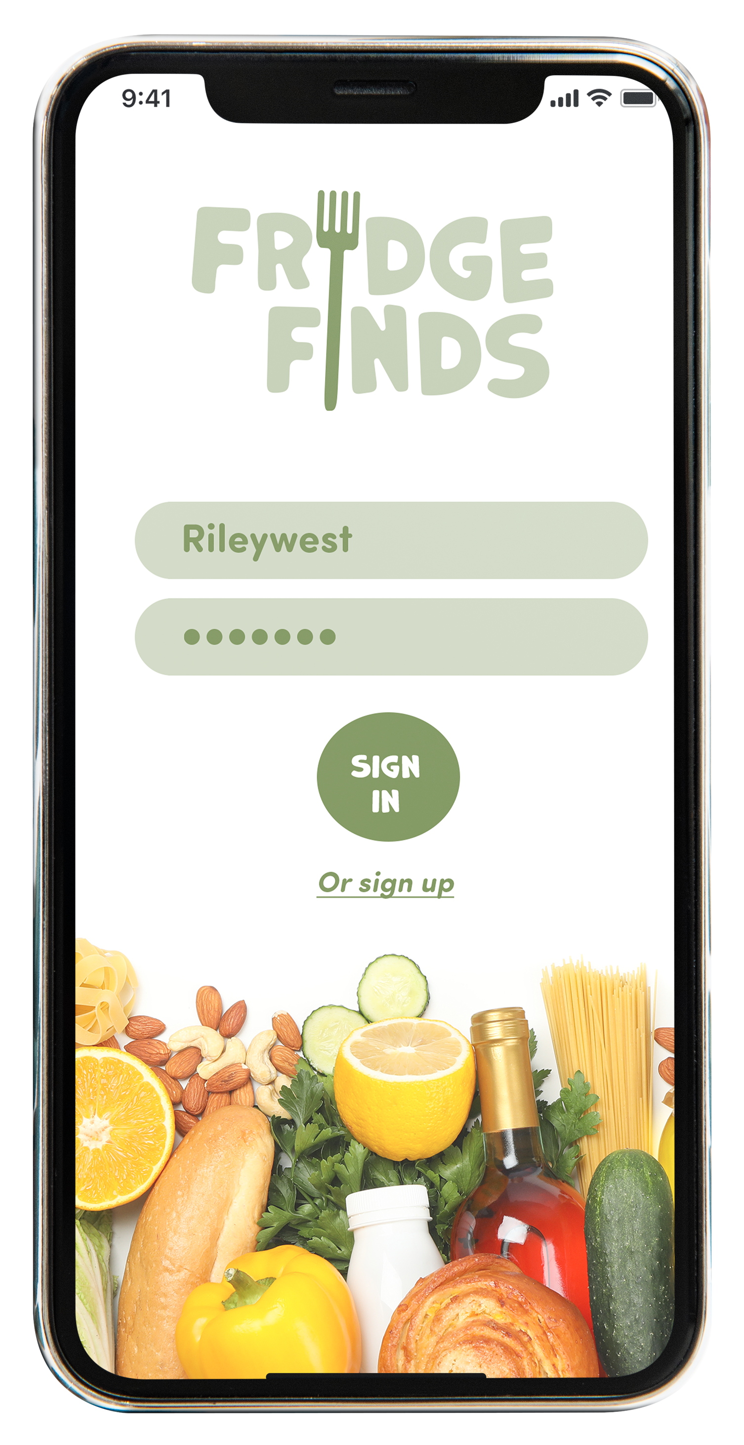
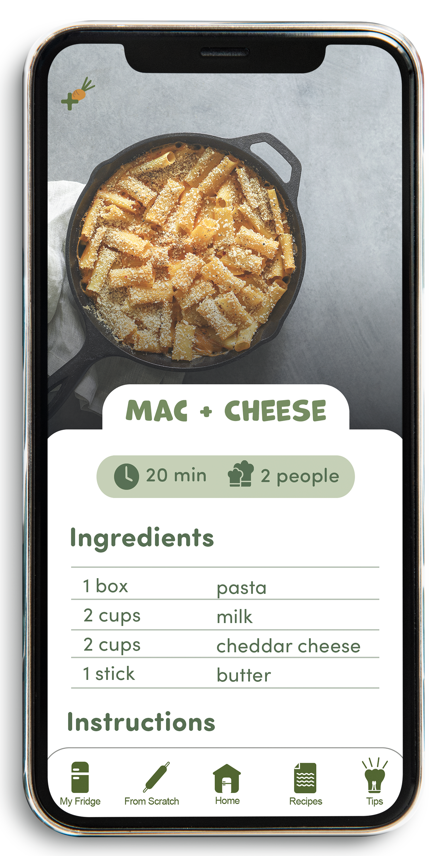
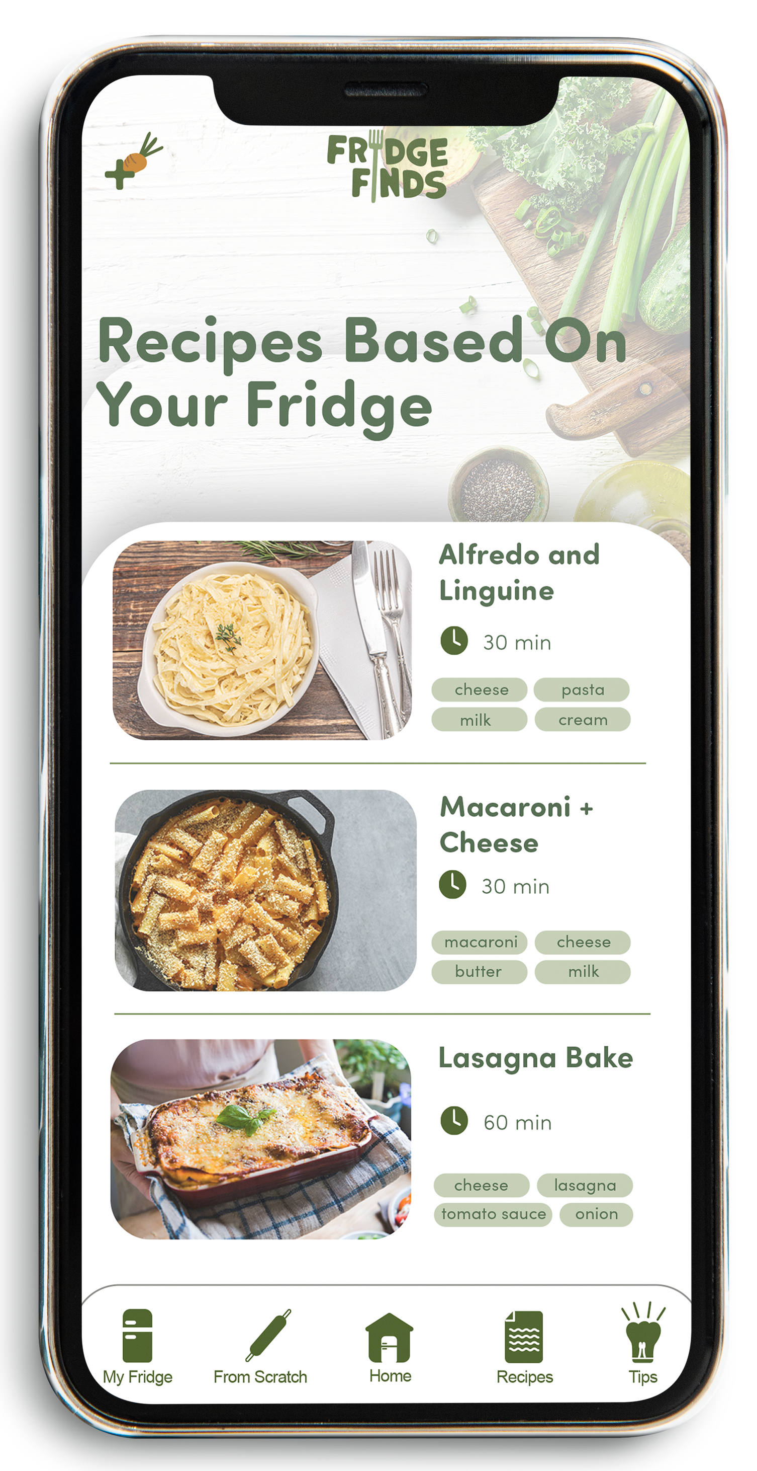
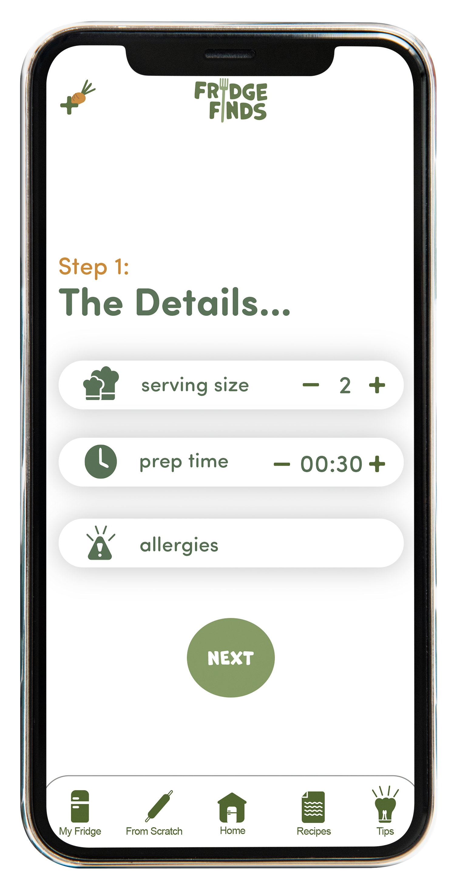
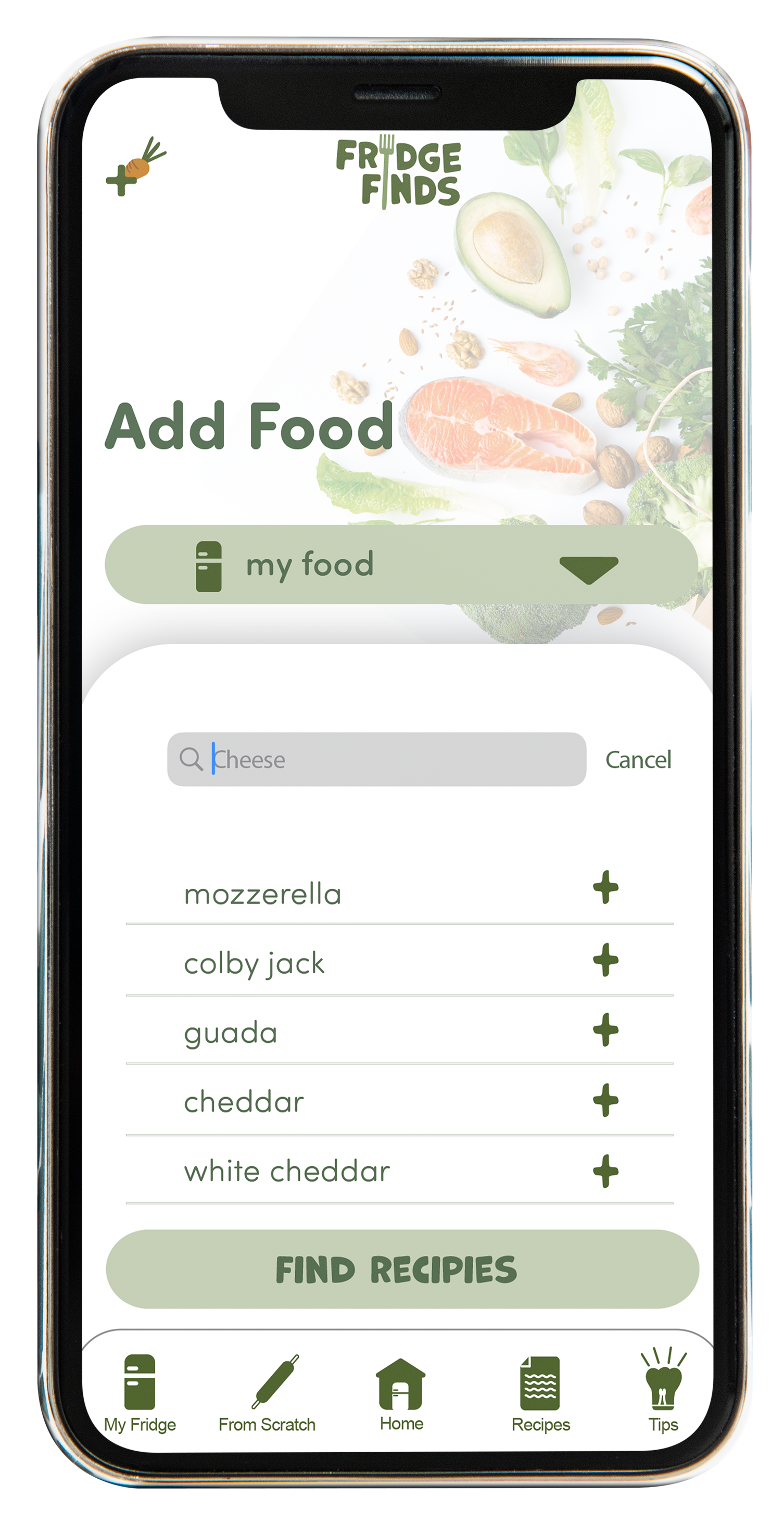
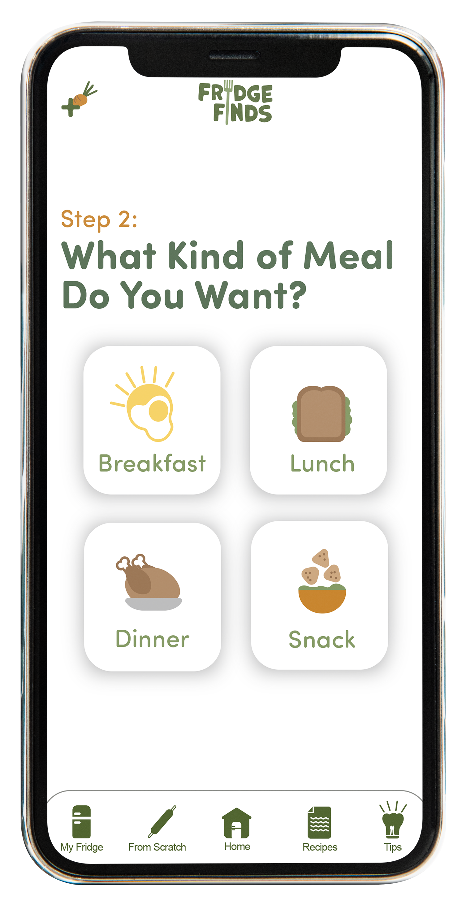
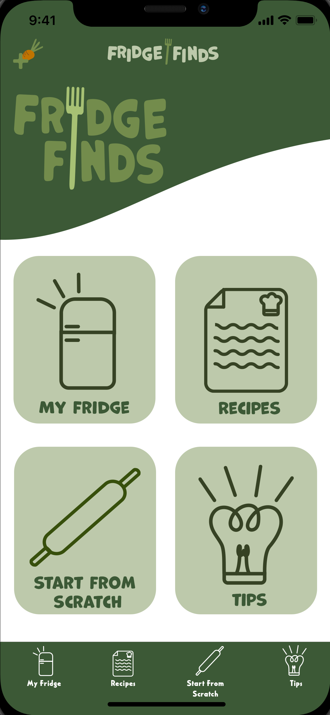
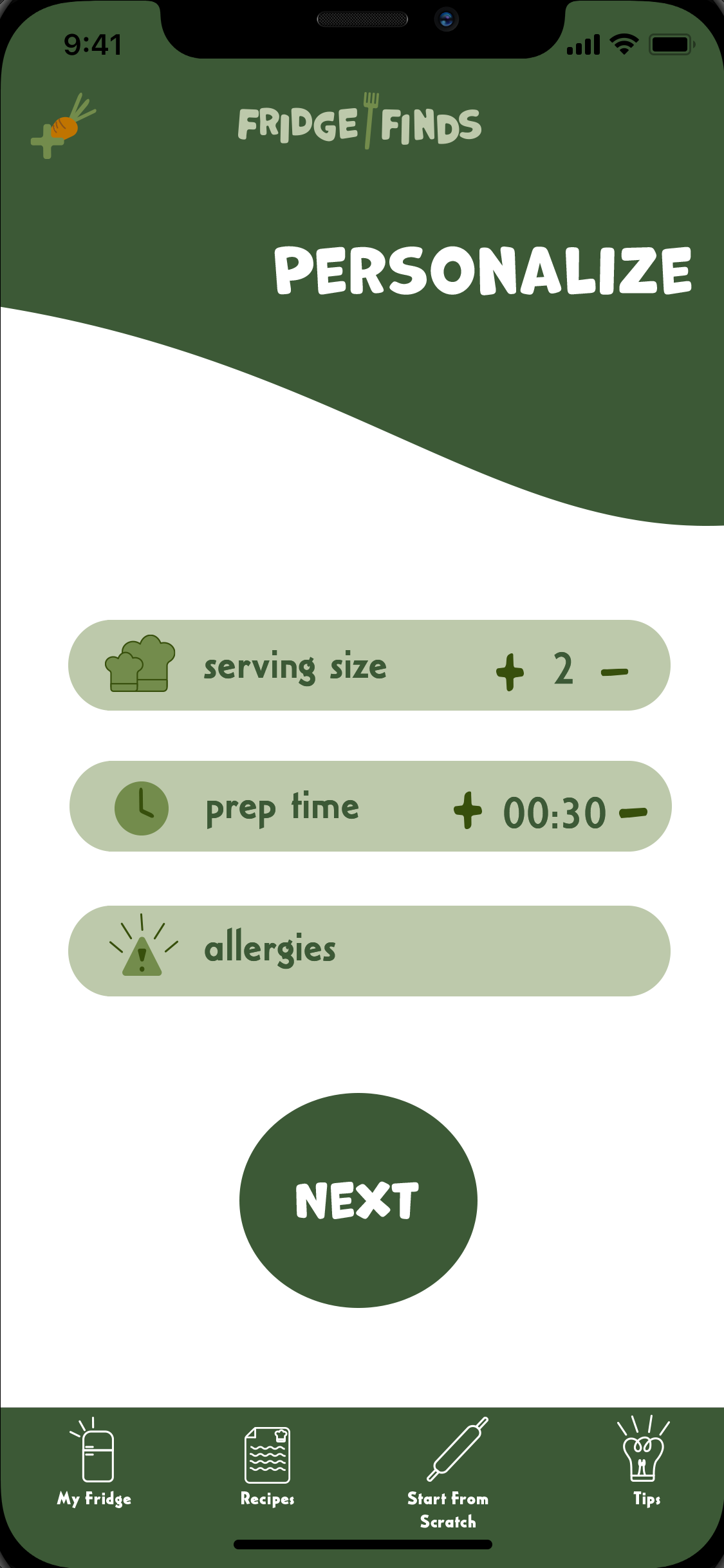
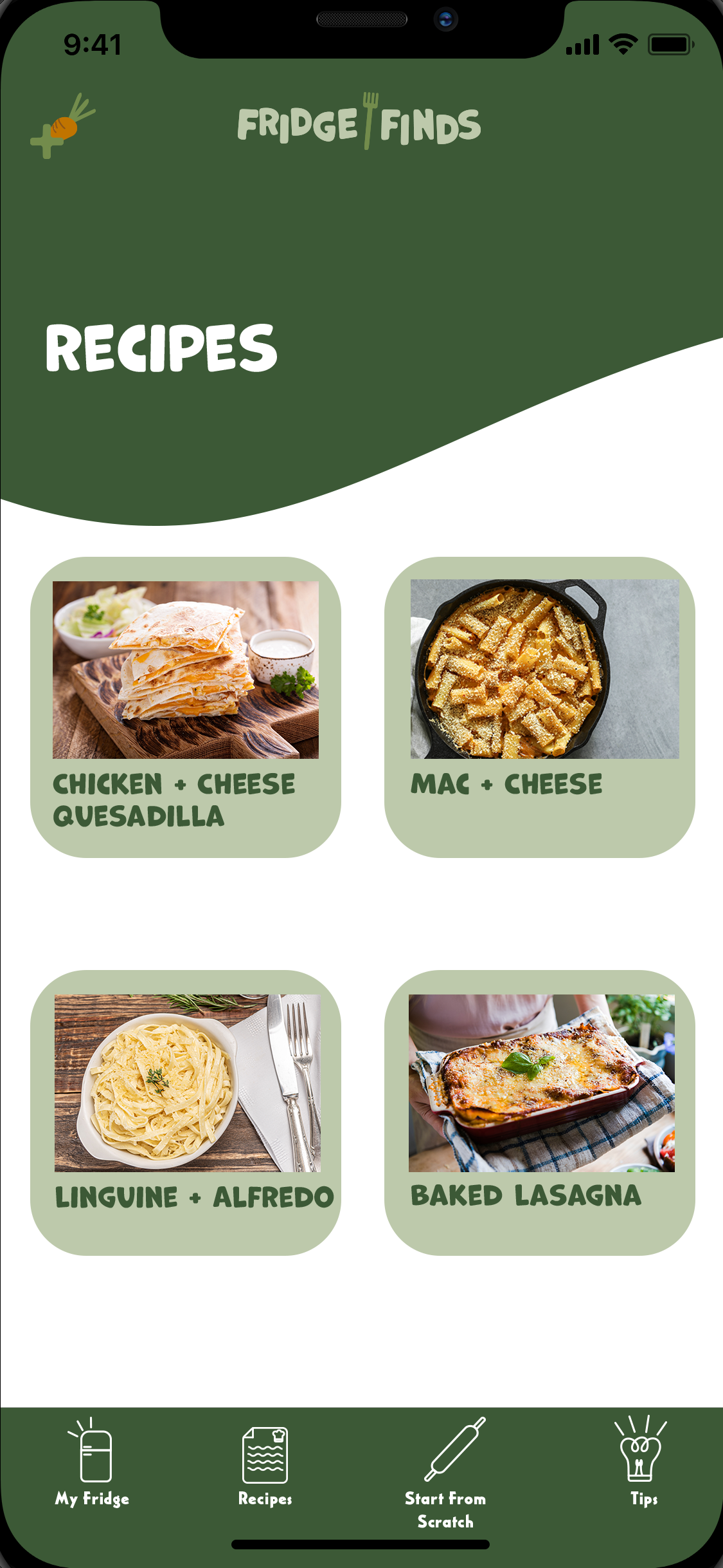
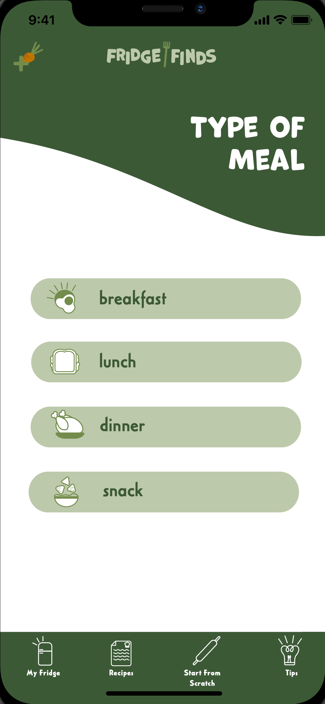
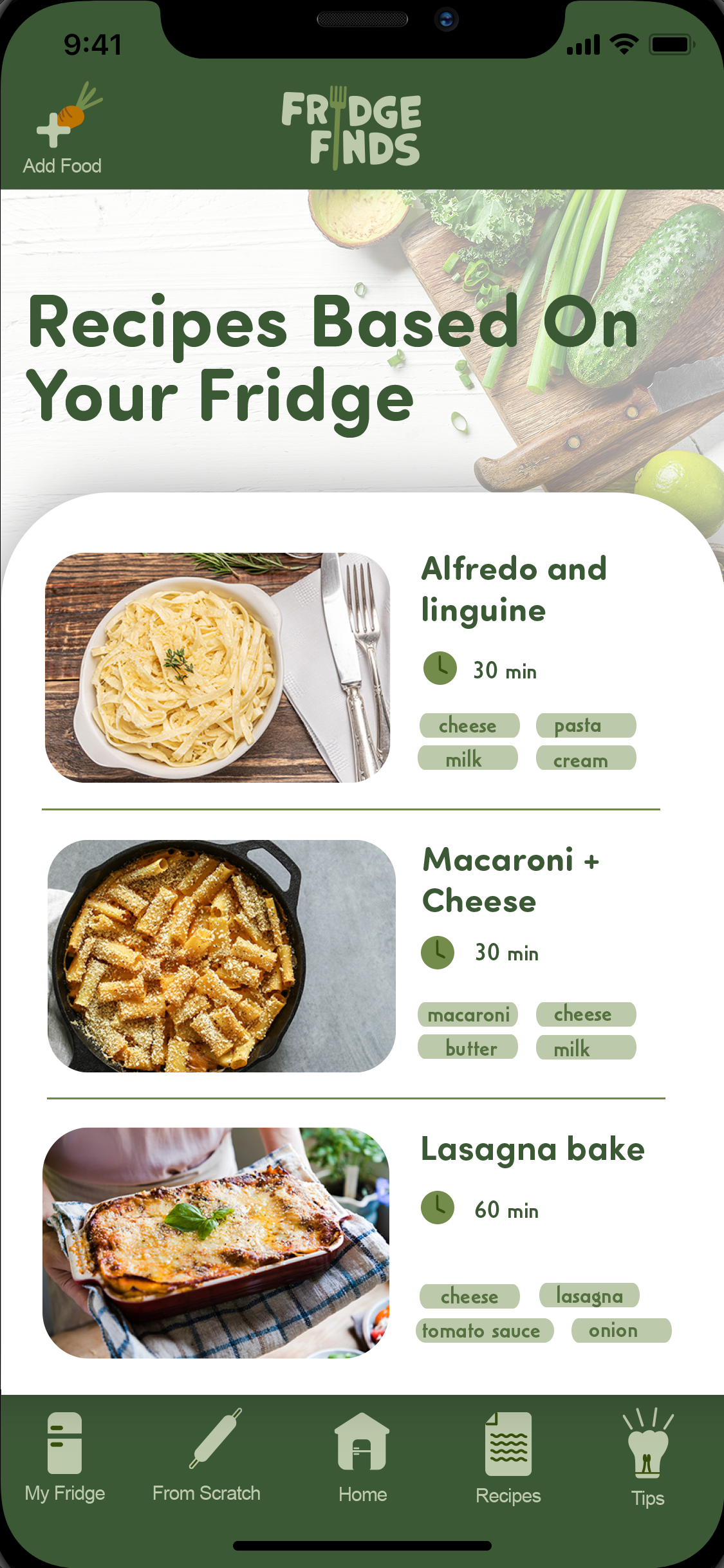
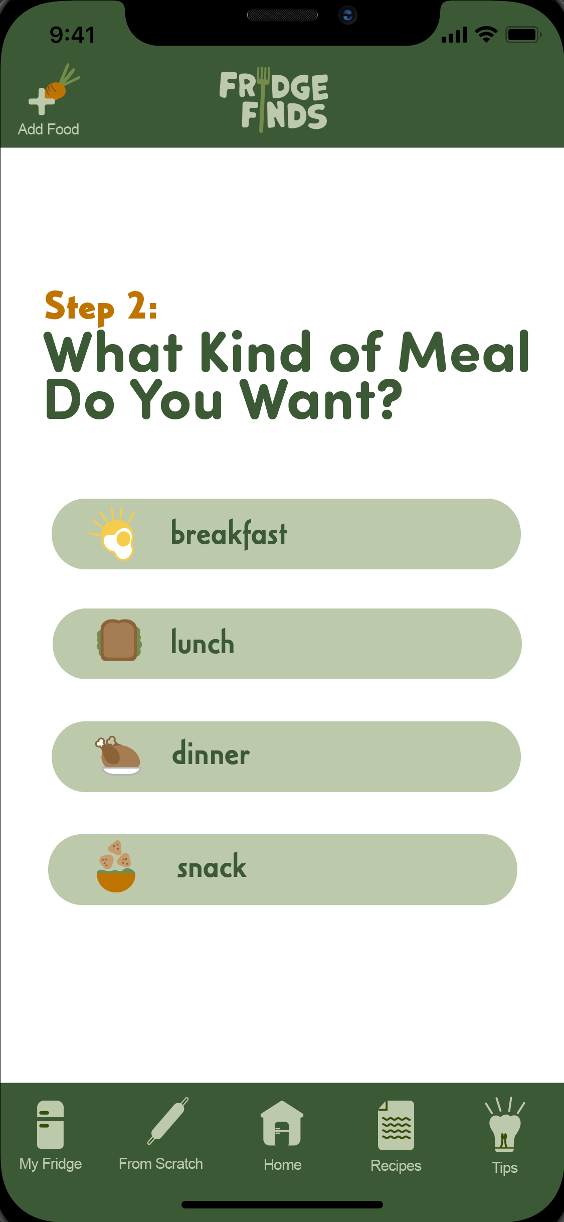
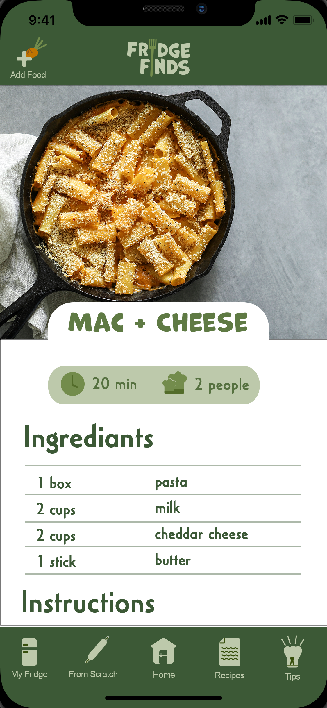
FRIDGE FINDS
APP | UI/UX
This project entailed designing three posters showcasing a hierarchy of body copy, title, and symbol using the same content and color scheme. Based on the history and origin research, “R” was first designed to resemble a head. The entertaining 150-word paragraph and headline were written to personify the letter by explaining its search for a crown to rest upon its “head.”
The Crown Royal logo inspires the decorated serif font and color palette. The colors are closely related to royalty and regal elements. The gold and purple color scheme represents richness and class. Rafaella Regular Shadow is strong and sturdy with romantic flowing swashes that give the letter an expensive and important look. A bevel and emboss effect makes the letter and title stand out and look gold. Baskerville is a sophisticated and timeless font that doesn’t overshadow Rafaella’s characteristics making it great for body copy.

PAGES
