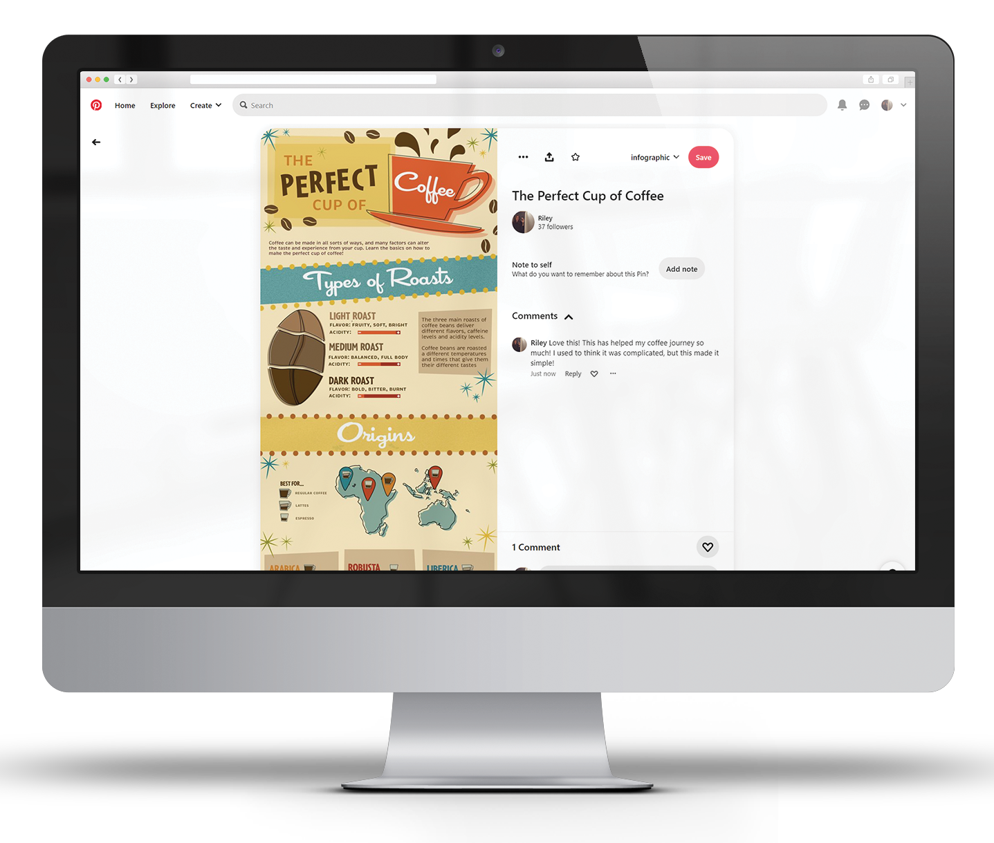
THE PERFECT CUP OF COFFEE
INFOGRAPHIC | POSTER
This infographic informs the audience about what goes into making a good cup of coffee. This makes coffee more accessible to anyone curious about all the flavors, elements, and personalization that go into their cup of coffee. This graphic would be seen on Pinterest because this platform tends to be visual, informative, and inspirational. The style is inspired by midcentury and retro design. This style is prominent because of the 50s coffee diner nostalgia. The typefaces used are Cocktail Shaker, Brevia, and Cafeteria which signify the typography seen on midcentury posters, signs, and menus. The Illustrations are designed to be imperfect and outlined that relates to the time period’s cartoon and artistic style. Embellishments such as coffee beans and stars also provide emphasis on the style. The icons represent concepts of coffee acidity, pros and cons, map locations, espresso, coffee, and lattes.


